Python openpyxl Excel绘制柱形图
本文最后更新于:2023年4月15日 下午
这是一份openpyxl的使用指南。
大体内容翻译自官网 https://openpyxl.readthedocs.io/en/stable/charts/bar.html#vertical-horizontal-and-stacked-bar-charts
本文在官网基础上会有一些改动。代码请参考 https://github.com/RustFisher/python-playground
本文链接 https://rustfisher.com/2019/11/14/Python/Python-openpyxl_charts_Bar_and_Column/
柱形图
数据会被绘制成垂直,水平或者是层叠效果的柱形图。
注意:
- 接下来的设置会影响到不同类型的图表。
- 设置类别可以控制柱形图是垂直或是水平。
- 使用层叠图形时,需要设置overlap成100。
- 如果柱形是水平的,x和y坐标会对调过来。
2D图表
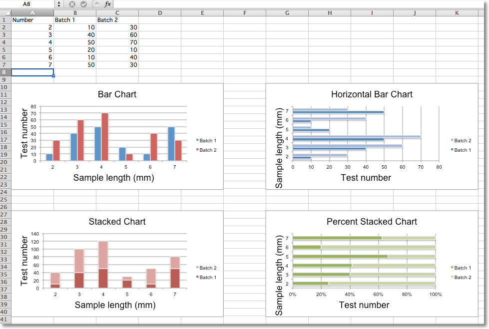
示例代码如下,根据给定的数据绘制了4张图表。1
2
3
4
5
6
7
8
9
10
11
12
13
14
15
16
17
18
19
20
21
22
23
24
25
26
27
28
29
30
31
32
33
34
35
36
37
38
39
40
41
42
43
44
45
46
47
48
49
50
51
52
53
54
55
56
57
58
59
60
61
62
63
64
65
66
67
68from openpyxl import Workbook
from openpyxl.chart import BarChart, Series, Reference
def bar_chart_demo():
wb = Workbook(write_only=True)
ws = wb.create_sheet()
rows = [
('Number', 'Batch 1', 'Batch 2'),
(2, 10, 30),
(3, 40, 60),
(4, 50, 70),
(5, 20, 10),
(6, 10, 40),
(7, 50, 30),
]
for row in rows:
ws.append(row)
chart1 = BarChart()
chart1.type = "col"
chart1.style = 10
chart1.title = "Bar Chart"
chart1.y_axis.title = 'Test number'
chart1.x_axis.title = 'Sample length (mm)'
data = Reference(ws, min_col=2, min_row=1, max_row=7, max_col=3)
cats = Reference(ws, min_col=1, min_row=2, max_row=7)
chart1.add_data(data, titles_from_data=True)
chart1.set_categories(cats)
chart1.shape = 4
ws.add_chart(chart1, "A10")
from copy import deepcopy
chart2 = deepcopy(chart1)
chart2.style = 11
chart2.type = "bar"
chart2.title = "Horizontal Bar Chart"
ws.add_chart(chart2, "I10")
chart3 = deepcopy(chart1)
chart3.type = "col"
chart3.style = 12
chart3.grouping = "stacked"
chart3.overlap = 100
chart3.title = 'Stacked Chart'
ws.add_chart(chart3, "A27")
chart4 = deepcopy(chart1)
chart4.type = "bar"
chart4.style = 13
chart4.grouping = "percentStacked"
chart4.overlap = 100
chart4.title = 'Percent Stacked Chart'
ws.add_chart(chart4, "I27")
wb.save("out/bar.xlsx")
if __name__ == '__main__':
bar_chart_demo()
译者注:这里调整了图表在excel中的位置,原文是在
G列,即G10和G27,这里改为了I列。代码格式也有微调。
我们需要生成图表的时候,Excel会要我们先选定数据范围(来源)。在代码中用Reference来指定数据来源范围。
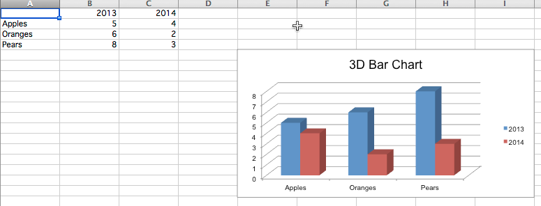
3D图表
绘制3D图表,使用BarChart3D。1
2
3
4
5
6
7
8
9
10
11
12
13
14
15
16
17
18
19
20
21
22
23def bar_3d():
wb = Workbook()
ws = wb.active
rows = [
(None, 2013, 2014),
("Apples", 5, 4),
("Oranges", 6, 2),
("Pears", 8, 3)
]
for row in rows:
ws.append(row)
data = Reference(ws, min_col=2, min_row=1, max_col=3, max_row=4)
titles = Reference(ws, min_col=1, min_row=2, max_row=4)
chart = BarChart3D()
chart.title = "3D Bar Chart"
chart.add_data(data=data, titles_from_data=True)
chart.set_categories(titles)
ws.add_chart(chart, "E5")
wb.save("out/bar3d.xlsx")
创建好的图表用WPS打开发现是2D的。用Office Excel打开是3D的。